
Growth
BillFoldify Facebook Growth Strategy
A practical Facebook Page strategy for BillFoldify, including a 3-times-daily posting rhythm, image guidance, and a simple launch plan for a free iOS and Android app.
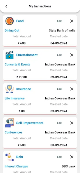
BillFoldify is already live on iOS and Android, which makes Facebook a strong place to build awareness, trust, and repeat visits without asking people to pay up front.
Because the app is free, the goal on Facebook is not hard-sell conversion. The goal is to make the product familiar, useful, and easy to remember when someone is ready to download a budgeting app.
Positioning
BillFoldify should be presented as the calm, practical money app for people who want to:
- track expenses without friction;
- build budgets they can actually follow;
- understand spending patterns;
- stay on top of recurring bills;
- manage money on both iPhone and Android.
That positioning works well because it is simple, broad, and easy to repeat in many different post formats.
Content pillars
Use four content pillars so the Page does not feel repetitive:
-
Money clarity
Short tips that help people understand spending, budgeting, and planning. -
Product moments
Screenshots, feature highlights, and visual walkthroughs of BillFoldify in action. -
Real-life use cases
Student budgeting, family spending, daily expense tracking, recurring bills, and monthly planning. -
Trust and habit building
Privacy, consistency, easy setup, and why a free app can still be useful and reliable.
Posting rhythm
Post 3 times per day with one clear purpose per post.
- Morning post: educational or motivational.
- Afternoon post: product feature or visual proof.
- Evening post: use case, reminder, or soft CTA to download.
Keep the cadence steady rather than random. Facebook Pages perform better when people learn what kind of value to expect.
Daily schedule
Here is a simple schedule you can reuse every day:
| Time | Post goal | Format | Best angle |
|---|---|---|---|
| 8:30 AM | Awareness | Text + image | A quick money tip or budgeting thought |
| 1:00 PM | Product education | Screenshot + short caption | One BillFoldify feature, one benefit |
| 7:30 PM | Action | Image + CTA | Free app reminder, download prompt, or habit story |
If you are posting in a different timezone, keep the same spacing and shift the hours to match when your audience is most active.
What each post should include
Every post should have:
- one idea only;
- one image or screenshot;
- one short caption;
- one CTA;
- no more than 2 hashtags.
That keeps the feed clean and makes the message easier to absorb on mobile.
Image strategy
Since you want to post with an image every time, make the visuals do real work:
- use app screenshots instead of generic stock photos whenever possible;
- crop for mobile-first viewing;
- add a short headline on the image, not a paragraph;
- show a real app screen, number, or progress state;
- keep branding consistent with the site colors and logo;
- use the same visual style across the Page so the feed feels like one product.
Good image types for BillFoldify:
- dashboard screenshots;
- budget progress visuals;
- expense category summaries;
- recurring payment reminders;
- comparison cards like “before / after” or “spending this month / last month”;
- app store promo cards with the iOS and Android icons.
Three posts per day
Here is a repeatable 3-post system that fits BillFoldify well.
Post 1: morning education
Goal: teach something useful in one sentence.
Example:
Small budgets work when you check them often, not when you hope for the best.
Image idea: a simple card with a budgeting tip and BillFoldify branding.
Post 2: afternoon product proof
Goal: show the app doing the thing.
Example:
Track spending, stay organised, and see your money clearly in BillFoldify.
Image idea: dashboard or transaction screen screenshot.
Post 3: evening download reminder
Goal: turn attention into installs.
Example:
BillFoldify is free on iOS and Android. If you want a cleaner view of your money, try it tonight.
Image idea: app store promo image or phone mockup with both store badges.
Seven-day rotation
Rotate the same structure across the week so the page stays fresh:
- Monday: fresh start and weekly planning
- Tuesday: spending control
- Wednesday: budgeting progress
- Thursday: recurring bills and reminders
- Friday: weekend spending awareness
- Saturday: family or shared spending
- Sunday: monthly reset and review
This gives you enough variety without forcing a new campaign every day.
First 14 days
For a new Facebook Page, the first two weeks should focus on recognition.
Days 1 to 3
- introduce the app;
- explain that it is free;
- show the core benefit in one line;
- use clean branded screenshots.
Days 4 to 7
- highlight budgets, tracking, and spending insights;
- show one feature per post;
- keep the copy short and direct.
Days 8 to 10
- focus on lifestyle use cases;
- speak to students, professionals, and families;
- show the app helping with real-world money habits.
Days 11 to 14
- add stronger CTAs;
- remind people the app is free;
- encourage installs on iPhone and Android;
- test which image style gets the most clicks or comments.
Caption formula
Use a simple formula that is easy to repeat:
- Hook with a problem or benefit.
- Add one product line.
- Close with a small CTA.
Example:
Budgets are easier to keep when you can see them clearly.
BillFoldify helps you track spending, plan ahead, and stay organized on iPhone and Android.
Try the free app today.
Content themes that will likely perform well
- “How to stop losing track of small expenses”
- “Why free budgeting apps still matter”
- “One screen that makes monthly spending easier”
- “3 habits that improve money clarity”
- “What a simple budget actually looks like”
- “How to keep recurring bills from surprising you”
What to avoid
- long captions that bury the point;
- too many hashtags;
- stock photography that does not show the app;
- generic hype language;
- posting the same CTA every time;
- making the page sound like a finance lecture.
Measurement
Track these numbers weekly:
- post reach;
- link clicks;
- saves and shares;
- comments;
- store-page visits;
- installs or app-attribution clicks if available.
If one image style consistently performs better, reuse it more often. If educational posts get more comments and product screenshots get more clicks, keep both but change the ratio.
Recommended weekly mix
- 40% education
- 30% product proof
- 20% use cases
- 10% direct app reminder
That balance keeps the page useful without turning it into a wall of promotions.
Simple publishing rule
For BillFoldify, the safest organic strategy is:
- post useful content every day;
- show the app in almost every post;
- remind people the app is free;
- make the download step obvious;
- keep the tone calm and practical.
That is usually stronger than trying to look “viral.” For a finance app, consistency and trust are worth more than noise.
Starter CTA set
Use these CTAs in rotation:
- Download BillFoldify free on iOS and Android.
- Track spending in a calmer way.
- See where your money is going.
- Make your budget easier to follow.
- Try BillFoldify today.
Final recommendation
If you want a Facebook Page that can grow BillFoldify, publish 3 image posts per day, keep each post to one idea, and make the app visible in every creative.
Because the app is free, the main job of Facebook is not pressure. It is repetition, clarity, and trust.